Matt Brubeck
11 May 2010
Implementing the viewport meta tag in Mozilla Fennec
The upcoming release of Mobile Firefox (Fennec) 1.1 features improved
support for the <meta name="viewport"> tag. Previous version of Fennec
supported the width, height, and initial-scale viewport properties, but
had problems with some sites designed for iPhone and Android browsers.
We now support the same properties Safari does, and we changed Fennec to render
mobile sites more consistently on screens of different sizes and resolutions.
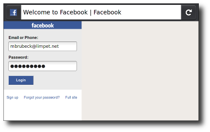
touch.facebook.com before:

touch.facebook.com after:

You can see these changes for yourself in the latest Fennec 1.1 or trunk nightly builds.
Background
Mobile browers like Fennec render pages in a virtual “window” (the viewport), usually wider than the screen, so they don’t need to mangle existing layouts by squeezing them into a tiny window. Users can pan and zoom to display different areas of the viewport.
Mobile Safari introduced the “viewport meta tag” to let web developers control the viewport’s size and scale. Many other mobile browsers now support this tag, although it is not part of any web standard. Apple’s documentation does a great job explaining how it works for web developers, but it leaves out some information that would be useful to browser vendors. For example, it says the content attribute is a comma-separated list, but existing browsers and web pages use a mix of commas, semicolons, and spaces as separators.
A pixel is not a pixel
The iPhone and many popular Android phones have 3- to 4-inch screens with 320×480 pixels (~160 dpi). Fennec’s target devices have the same physical size but 480×800 pixels (~240 dpi). Because of this, the last version of Fennec displayed many pages about one third smaller (in physical units) than iPhone or Android. This caused usability and readability problems on many touch-optimized web sites. Peter-Paul Koch wrote about this problem in A pixel is not a pixel is not a pixel.
Fennec 1.1 for Maemo will use 1.5 hardware pixels for each CSS “pixel,” following the lead of the Android browser. This means a site with “initial-scale=1” will render at the same physical size in Fennec for Maemo, Mobile Safari for iPhone, and the Android Browser on both HDPI and MDPI phones. It’s also consistent with the CSS 2.1 specification, which says:
If the pixel density of the output device is very different from that of a typical computer display, the user agent should rescale pixel values. It is recommended that the pixel unit refer to the whole number of device pixels that best approximates the reference pixel. It is recommended that the reference pixel be the visual angle of one pixel on a device with a pixel density of 96dpi and a distance from the reader of an arm’s length.
This change only affects web pages that explicitly set the viewport size or scale. The pixel ratio is 1.5 applies only if the viewport scale is set to 1. The size of a “pixel” on any page changes with the zoom level, and the default zoom level for most pages in Fennec has not changed.
On 240-dpi screens, pages with initial-scale=1 will effectively be zoomed to 150% by both Fennec and Android WebKit. Their text will be smooth and crisp, but their bitmap images will probably not take advantage of the full screen resolution. To get sharper images on these screens, mobile web developers can create images at 150% of their final size (or 200%, to support the rumored 320-dpi iPhone) and then scale them down using HTML/CSS.
WebKit on Android supports an additional undocumented target-densityDpi property, to let web developers override the CSS-to-device pixel ratio. Fennec doesn’t support this property now, but if we see a compelling need for it (or if it becomes part of a documented standard) then we might implement it too.
Right now Fennec uses the same default ratio of 1.5 on all devices. (This is a hidden preference that can be changed in about:config or by an add-on.) Later we’ll need to change this – as well as many other parts of Fennec’s user interface – to choose the correct size automatically, depending on the screen density.
Viewport width and screen width
Many sites set their viewport to width=320, initial-scale=1 to fit precisely onto the iPhone display in portrait mode. As mentioned above, this caused problems when Fennec 1.0 rendered these sites, especially in landscape mode. To fix this, Fennec 1.1 will expand the viewport width if necessary to fill the screen at the requested scale. This matches the behavior of Android and Mobile Safari, and is especially useful on large-screen devices like the iPad. (Allen Pike’s Choosing a viewport for iPad sites has a good explanation for web developers.)
We also added support for minimum-scale, maximum-scale, and user-scalable, with defaults and limits similar to Safari’s. These properties affect the initial scale and width as well as limiting zooming after the page is loaded.
Standards
<meta name="viewport"> is a good example of browsers innovating exactly how
Sachin Agarwal thinks they should. It was implemented by a single
browser, used by web developers, and copied by other browsers without waiting
for any standards organization. It has clearly improved on earlier solutions
like MobileOptimized and HandheldFriendly.
Now that viewport metadata has proved to be a useful extension to HTML, I think it is worth standardizing. According to the HTML5 spec, new names for the meta element should first be registered on the WHATWG wiki and then be ratified through the W3C standards process. If anyone at Mozilla or elsewhere is working on a standard specification for viewport metadata, please let me know. [Update: this is now being standardized as part of the CSS Device Adaptation spec.]